Wall Street Journal "Laugher"
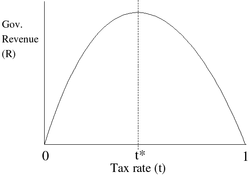
In case you missed it last week, the Wall Street Journal editorial page (Kevin Hassett in particular), known for its Fox News-like balance and fairness, made one more of its typical pleas for tax cuts by appealing to the so-called Laffer curve, which postulates that increasing tax rates reach a cusp at which point, paradoxically, revenues actually decline with higher rates. The paradox is resolved, claimed Arthur Laffer, by noting that this optimum point maximizes tax revenues because higher tax rates actually impede the growth of the economy thereby canceling out any further gains that higher rates might have provided. Here's the idea in graphical form:
Now the Wall Street Journal, in its journalistic wisdom, attempted to demonstrate the truth of this theory with the 2004 data of tax rates/revenues from various nations. Here is the scatter graph displaying their results and the curve they have added to interpret the data. Notice how the curve seems similar to the Laffer curve.
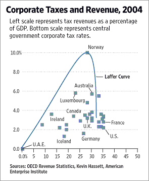
Of course, you may also notice that the curve doesn't actually resemble the data points. Even a high school statistics student would know that this is D- work in plotting the scatter graph, and that's just by eyeballing it without actually running the regression. It's pretty obvious to the untrained eye that we have here what you'd expect: a positive correlation (perhaps not high correlation, but moderate).
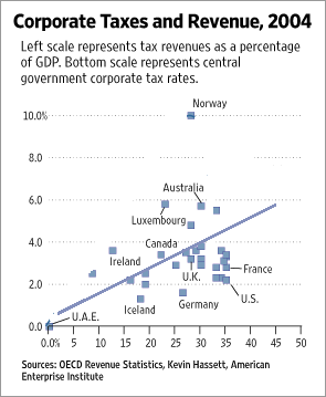
That is, as the tax rates increase, the government takes in more revenue. Of course, there is the outlier, Norway, but let's ignore it for now (more on it in a moment). As such, here is economist Mark Thoma's proper plotting of the scatter graph.
So it looks like the Wall Street Journal was just desperate to make their case for more tax cuts and sacrificed their intellectual integrity to do so. This is shocking, I know. However, it turns out to be even worse. Not only did they overemphasize an outlier to skew their case, they also manipulated the data in order to make Norway such an outlier in the first place. See Brad DeLong for the details:
Now the Wall Street Journal, in its journalistic wisdom, attempted to demonstrate the truth of this theory with the 2004 data of tax rates/revenues from various nations. Here is the scatter graph displaying their results and the curve they have added to interpret the data. Notice how the curve seems similar to the Laffer curve.
Of course, you may also notice that the curve doesn't actually resemble the data points. Even a high school statistics student would know that this is D- work in plotting the scatter graph, and that's just by eyeballing it without actually running the regression. It's pretty obvious to the untrained eye that we have here what you'd expect: a positive correlation (perhaps not high correlation, but moderate).
That is, as the tax rates increase, the government takes in more revenue. Of course, there is the outlier, Norway, but let's ignore it for now (more on it in a moment). As such, here is economist Mark Thoma's proper plotting of the scatter graph.
So it looks like the Wall Street Journal was just desperate to make their case for more tax cuts and sacrificed their intellectual integrity to do so. This is shocking, I know. However, it turns out to be even worse. Not only did they overemphasize an outlier to skew their case, they also manipulated the data in order to make Norway such an outlier in the first place. See Brad DeLong for the details:
One more point, with respect to "omitting Norway": Personally I see no need to omit Norway. I do see a need to plot the Norway point on the graph correctly. The revenues plotted on the vertical scale include oil excise taxes levied on corporations. The tax rates plotted on the horizontal scale do not--hence the Norway "tax rate" of 28% rather than the correct 52%. Move Norway out to its proper position--with the same tax concept on both axes--and everything is fine.Sheesh.
posted by wk at 10:42 AM
![]()

0 Comments:
Post a Comment
<< Home